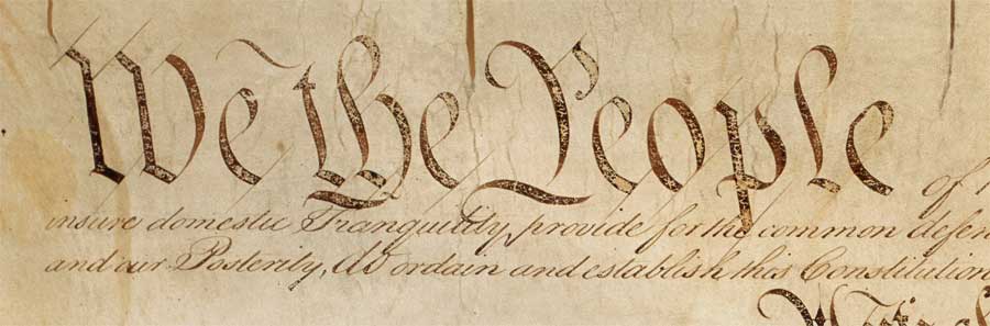
Like a strange migratory bird, this question comes around every year, usually during election season. “I need to write something, and I want it to look like the WE THE PEOPLE part. Do you carry that font?” “I don’t”, I say. “It’s not a font. It’s not made by mechanical means. Someone wrote that out by hand.” “By hand??” They are bewildered and disappointed. It’s not always the Constitution or some other venerated document. Sometimes it’s a product logo, or the Red Sox’s “B”. But if I had a nickel for every time I’ve been asked this question… I don’t think it’s a matter of individual ignorance – This isn’t…
-
-
Victorian Fonts on Good Omens!
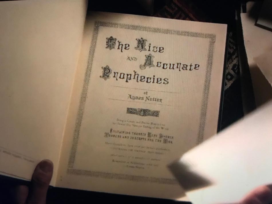
The other night I started watching Good Omens, the new Amazon Prime show. I hadn’t read the book and didn’t know what to expect. But I was done with Chernobyl, and I’ll watch anything with David Tennant, so why not. A few minutes in, and the props have a very familiar look about them. Sure enough, the prop designers made liberal use of the New Victorian Printshop fonts!
-
Advice & Sick Burns: The Girl’s Own Paper
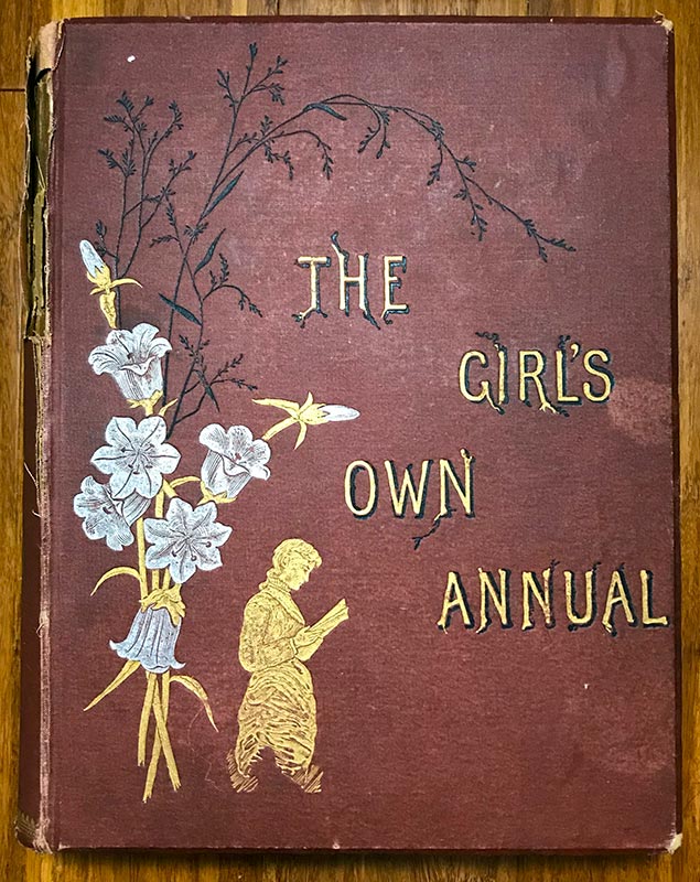
As you might imagine, I buy a lot of old books and ephemera, mostly for the type and illustrations. Here I’ve got a bound volume of “The Girl’s Own Paper” for 1882. The “G.O.P.” was a periodical for young women, published in England from 1880 until the 1950s. Bound periodicals aren’t very valuable in general, but this one is also coming apart, and the insides are a little fragrant – not really a keeper. The content, though, is most interesting!
-
The Letterform Archive in San Francisco
Earlier this month I attended a tech conference in San Francisco. At the last minute, my Monday schedule shifted and I’d have all afternoon to myself. What to do? Visit the Letterform Archive, of course! I first learned about this non-profit when they opened in 2015. They are keepers of everything to do with the history of written communication; their library of type design sources is reported to be massive. This place would draw me like a moth to fire any day, but even more so right now: I’m in the middle of research for my next design kit, I’m already in San Francisco, and now I’ve got the time,…
-
Of Noah Webster, and footnotes ignored
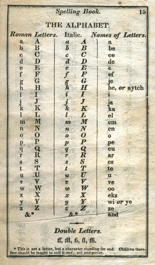
One of my favorite bits of typographical trivia holds that the “&” character is properly called “per-se and”, meaning “the word ‘and’ in and of itself”. This character was much more commonly used in the 18th and 19th centuries; it was even considered the 27th letter of the alphabet. But just yesterday I learned that this view wasn’t universally held. I have an 1820s copy of Noah Webster’s Blue Backed Speller on my bookshelf. Leafing through it, I found that the great American lexicographer and educational reformer also included “&” in the alphabet. Though according to a tiny footnote on the same page, he wasn’t down with the name at…
-
The Prop Art of “Time after Time”
Whatever sank ABC’s short-lived series Time after Time, it certainly wasn’t the prop design. The amazingly talented graphic artist Jannick Guillou created reams of utterly believable historic documents, many of which feature fonts, ornaments, borders, and images from the New Victorian Printshop design kits. Dead Man’s Hand WF from the Wild West Press adds rustic handwritten annotations to these elaborate documents. Curiously, several of the documents appear to be signed by Stonewall Jackson, U. S. Grant, and other Civil War personalities. These signatures come from the Union Signatures and Confederate Signatures fonts that are part of the Civil War Press design kit.
-
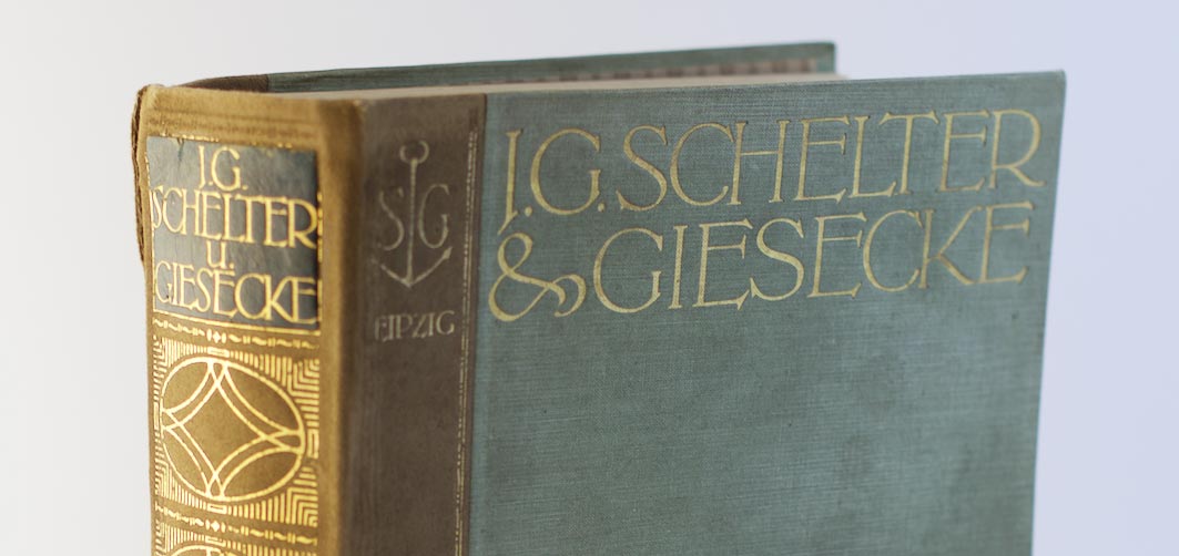
The 1912 Schelter & Giesecke Specimen Book
Here is last year’s Christmas gift to myself: a hefty catalog of long-forgotten typefaces by a famed German type foundry, which I managed to snag on eBay. More than a mere listing of available fonts, the book aims to show the foundry’s wares in the best possible light, putting the fonts through their paces in a variety of attractive use examples, artful layouts, and eye-popping arrangements. There even is a mock newspaper tipped into the book. What attracted me to this book was not the selection of Fraktur typefaces you’d expect to see from a German type foundry of the time, but the wealth of Art Nouveau typefaces displayed in…
-
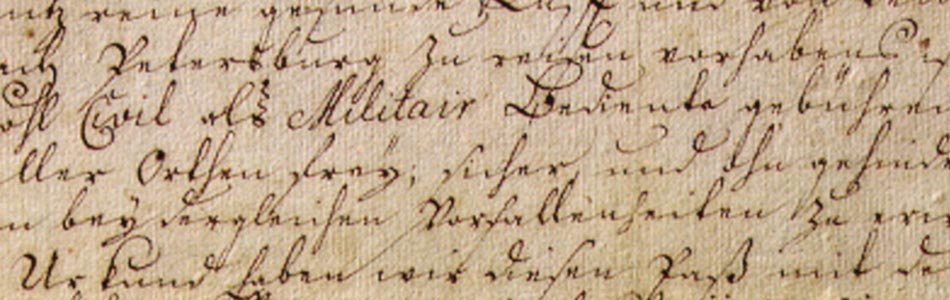
A History of the Old German Script
There is currently much discussion as to the origin and development of the Old German script. There are as many different opinions as there are voices talking about it. To avoid further confusion and clear up the record, I’d like to trace the origins and development of the Old German Script from its beginnings in the first half of the 16th century to its termination as the “standard” German script in 1941.
-
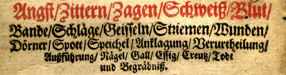
A Brief History of Fraktur
At the end of the 15th century most Latin books in Germany were printed in a dark, barely legible gothic type style known as Textura. What little was printed in German used the rougher and more base Schwabacher type. When the German emperor Maximilian (reigned 1493-1517) decided to establish a splendid library of printed books, he directed that a new typeface be created especially for this purpose. This typeface was to be more elegant than the boorish Schwabacher, more modern than the gothic Textura and yet distinctly “German” in that it should not incorporate elements of the Antiqua style typefaces that the humanist movement had just created in Italy based on ancient roman lettering,…
-
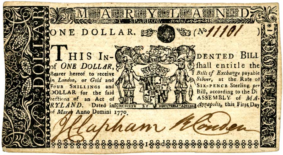
A Brief History of Printing in America
When we think of the history of printing in America today, we are most likely to place the starting point with Ben Franklin and some of the other great American printers of the 18th century. In fact, as early as fifty years after its invention the printed word had become an integral part of Western culture, and wherever European discoverers ventured, a printing press was sure to follow.