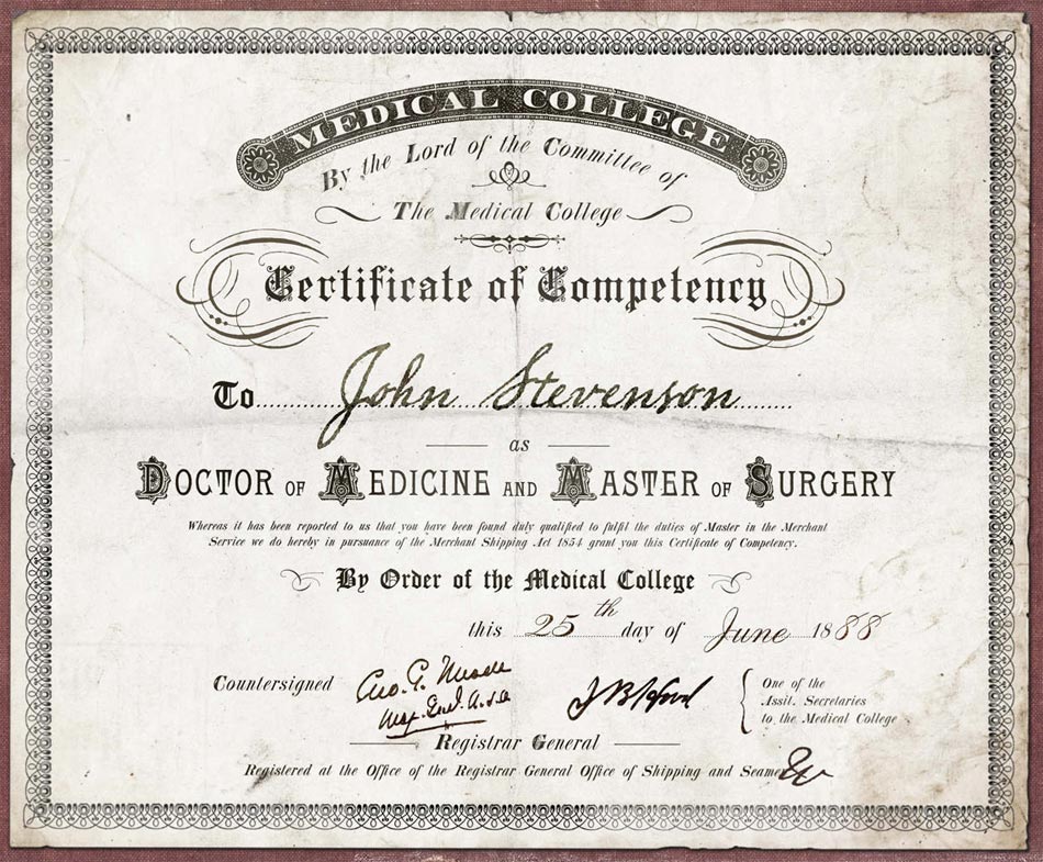
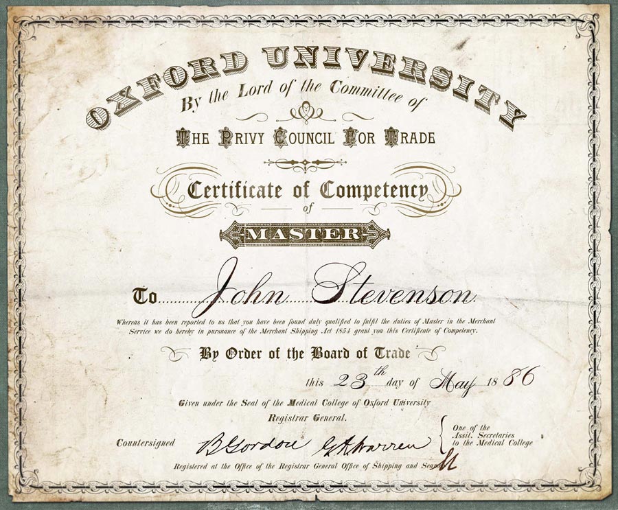
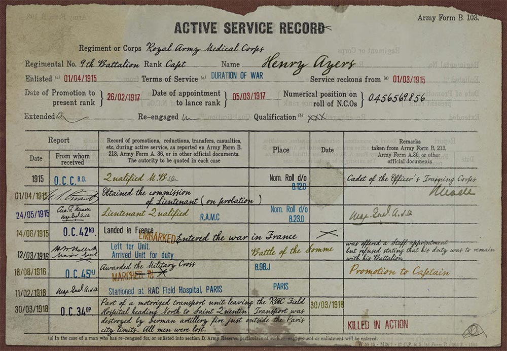
Whatever sank ABC’s short-lived series Time after Time, it certainly wasn’t the prop design. The amazingly talented graphic artist Jannick Guillou created reams of utterly believable historic documents, many of which feature fonts, ornaments, borders, and images from the New Victorian Printshop design kits. Dead Man’s Hand WF from the Wild West Press adds rustic handwritten annotations to these elaborate documents. Curiously, several of the documents appear to be signed by Stonewall Jackson, U. S. Grant, and other Civil War personalities. These signatures come from the Union Signatures and Confederate Signatures fonts that are part of the Civil War Press design kit.


One Comment
Yama Ploskonka
I am fascinated by prop design. My particular pet or peeve is /paper/. It shows I’m not much into movies, and certainly not into cable TV, when I say that one of the best “paper as prop” I’ve come across is Hiccup’s journal in How To Train Your Dragon…
Seriously now, Diana Burton, prop master for “The Post”, really got it right. Those Pentagon Files, the personal letters, all the stationery, you could almost “touch” the 1960s paper, the feel was just right. On the other hand, whomever did the Harry Potter movies had no idea, bless their hearts and huge funding. Yes, I have this ugly tendency to “bond” with what I am about to read by what my hand tells me. Lucky for all that there’s only a few of us infirm that way.
(my personal achievement: Medieval-“like” paper, both in laid structure (not that uncommon) but also in the surface “tooth”, as it was until the early 1600s due to rough wool felts, but then disappeared forever – not quite, after 600 years two people in the world have re-created it independently from each other, both in 2017, in my case in November)